
⚠️🤖 SECTION UNDER CONSTRUCTION 🤖⚠️
Wirestock
Using human resources to train AI models for branding projects in collaboration with Wirestock. Brands and their respective visual identities were created to aid the development of AI tech in the field of design, branding and art direction.
Q1 2026
AI Training | Dataset Creation


Brand #1
The name for this high-end furniture brand comes as a reference to the characteristic crimson color of both saffron and redwood. The rich reddish tone inspired the branding process from the visuals to the actual logotype.
The logo uses two "F" letters from the main typography facing away from each other to create a logo mark that references both an organic vegetal shape (as a reference to both saffron and redwood trees) and the corner of a chair in isometric view.
I played with PERSPECTIVE and simple shapes to create the Saffron logo.
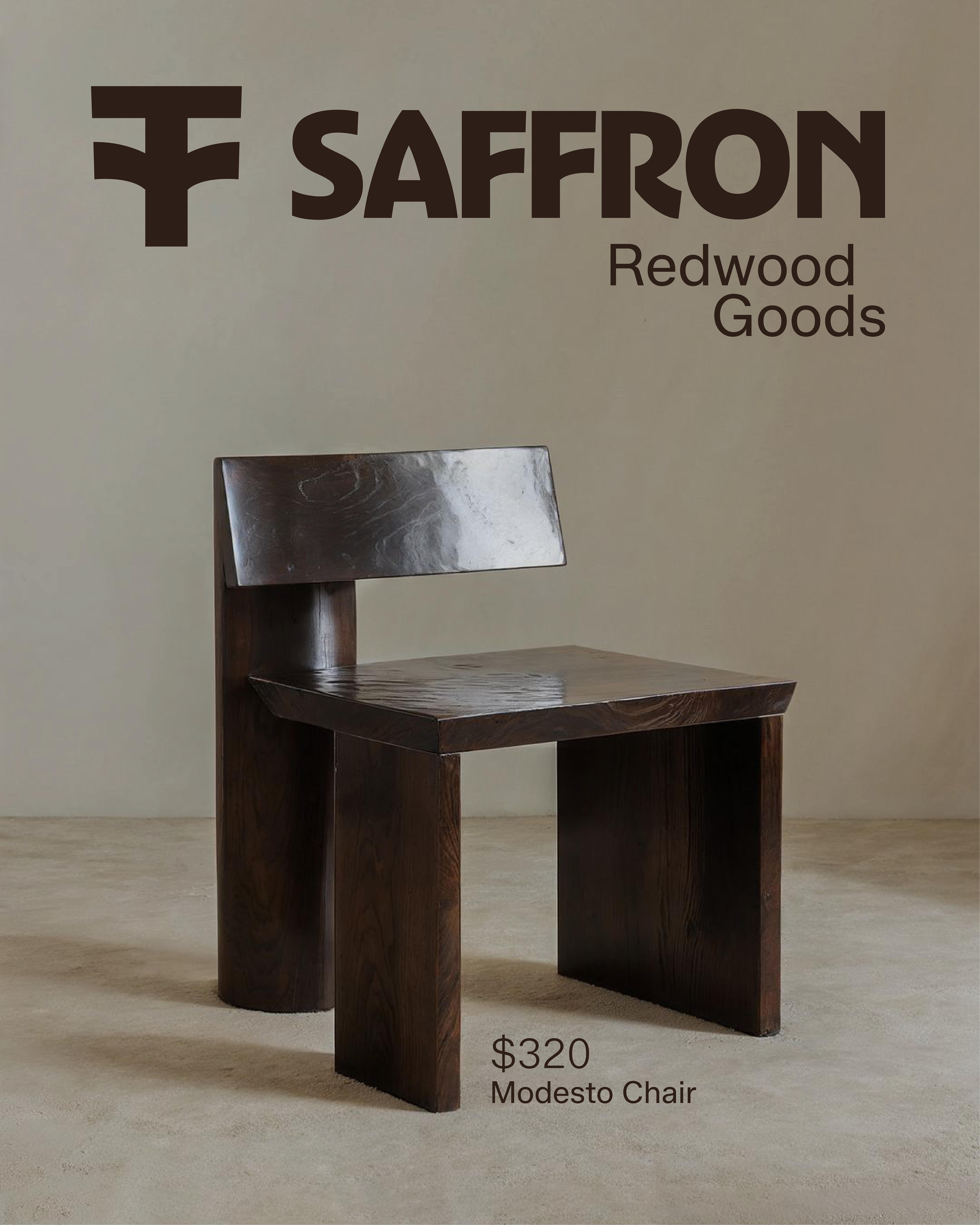
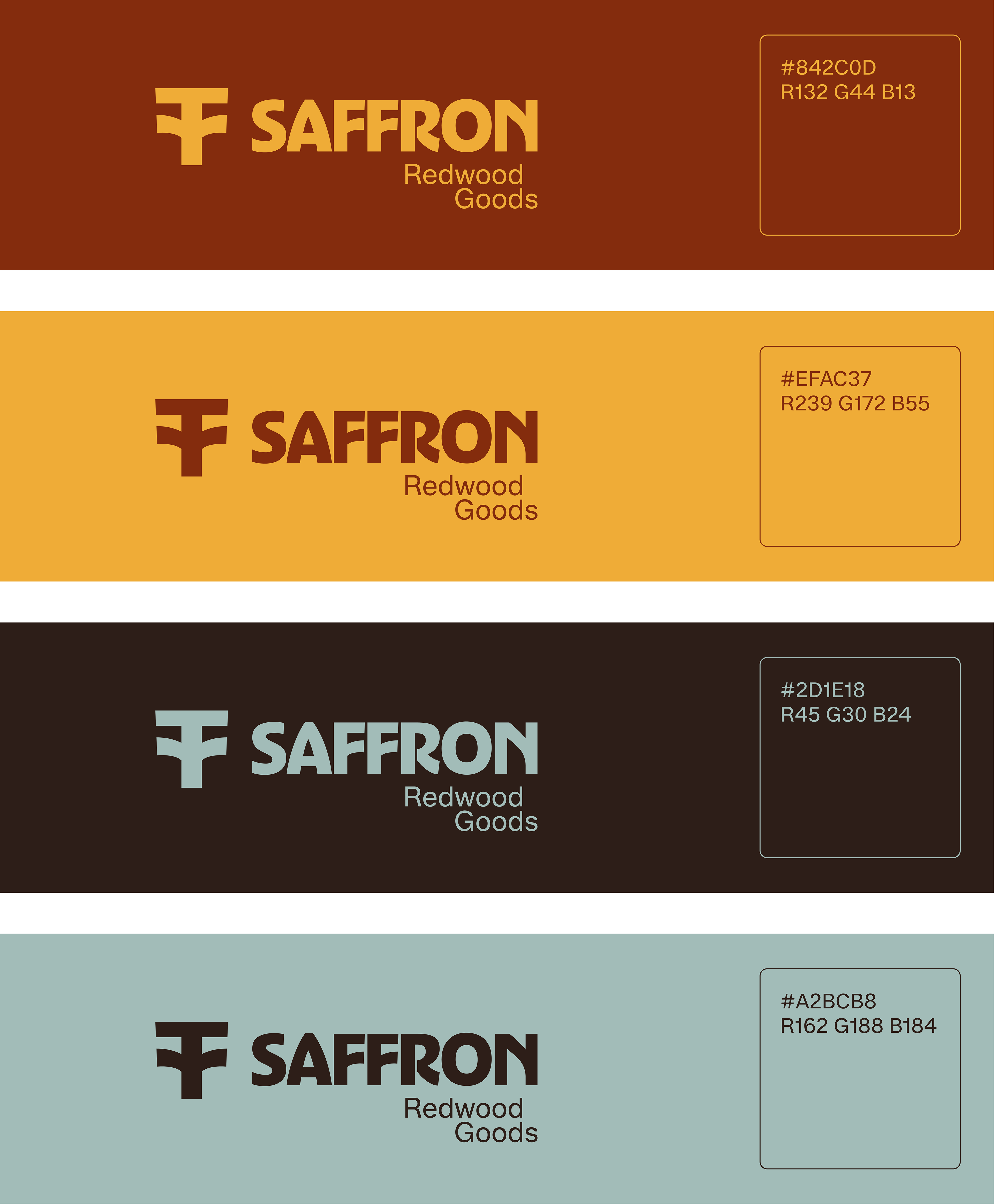

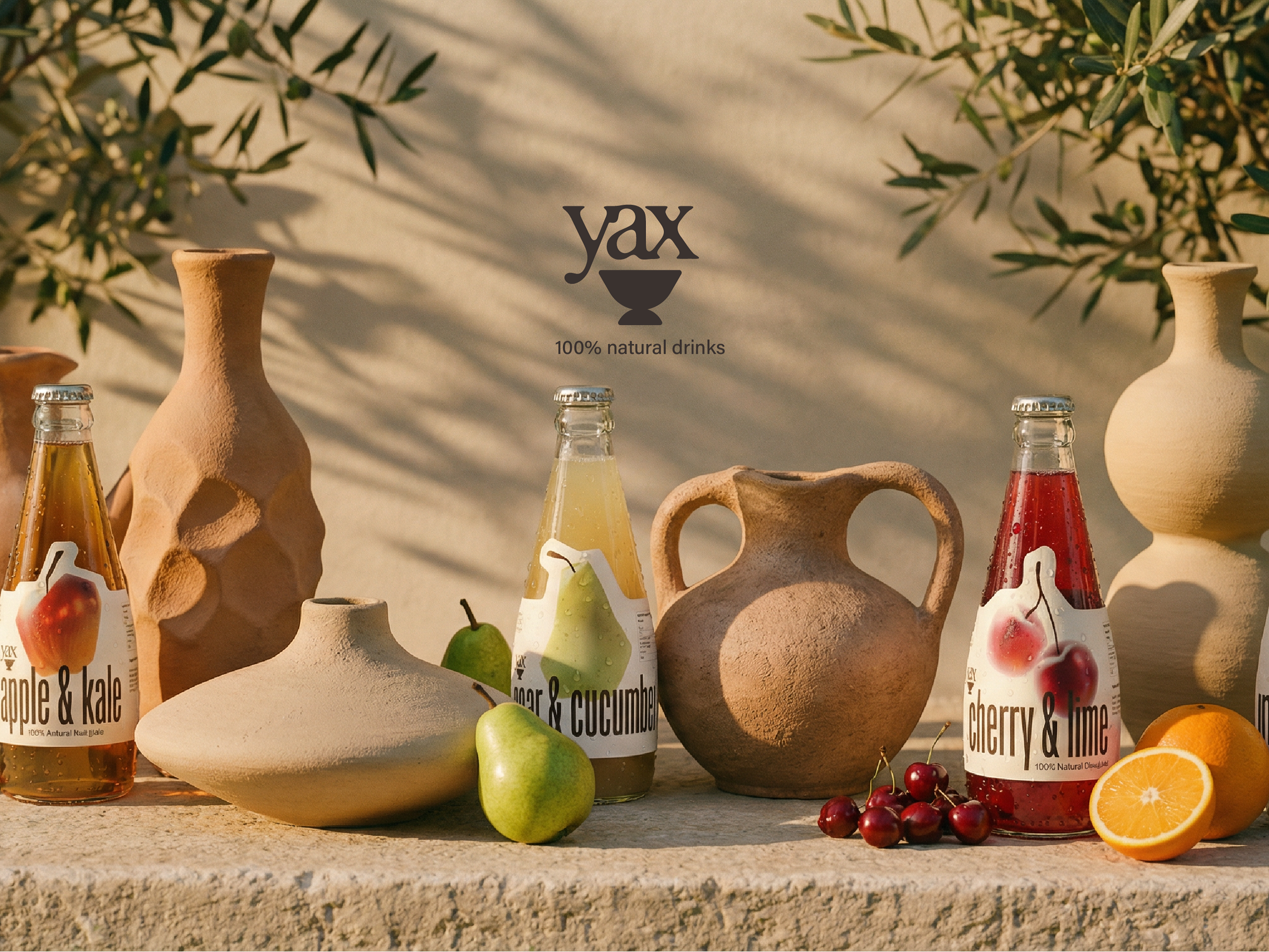
Saffron
Brand bento.
With every branding project, I like to add a selection of visuals that synthesizes the brand's aesthetics and visual feel. All neatly packaged like a well arranged bento box!
_________________________________________________________________________
Brand #2
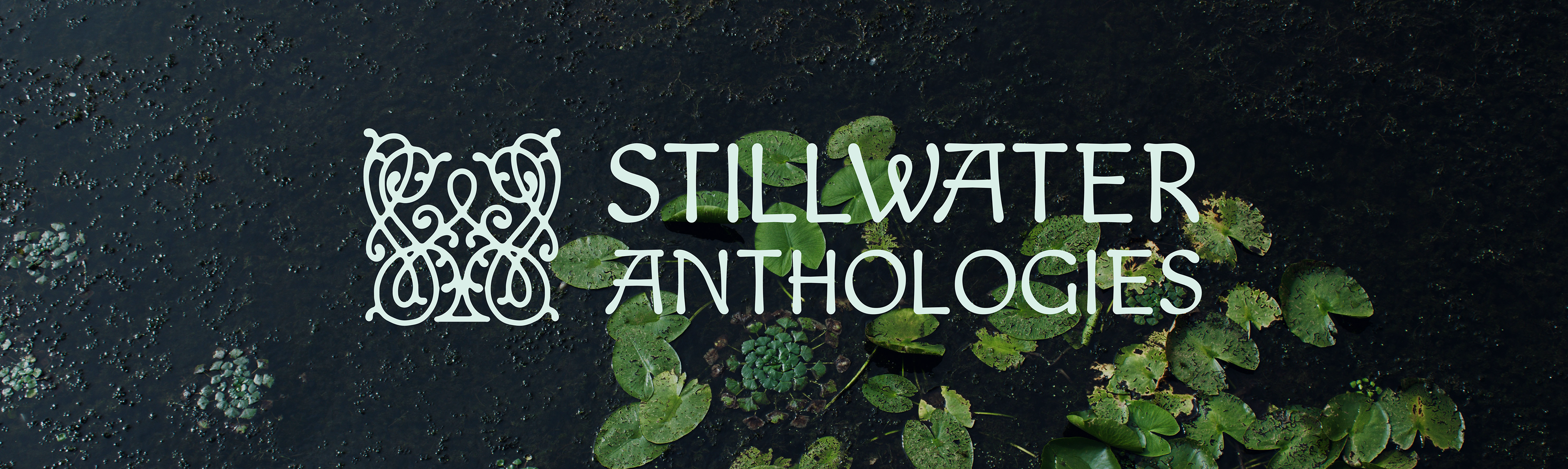
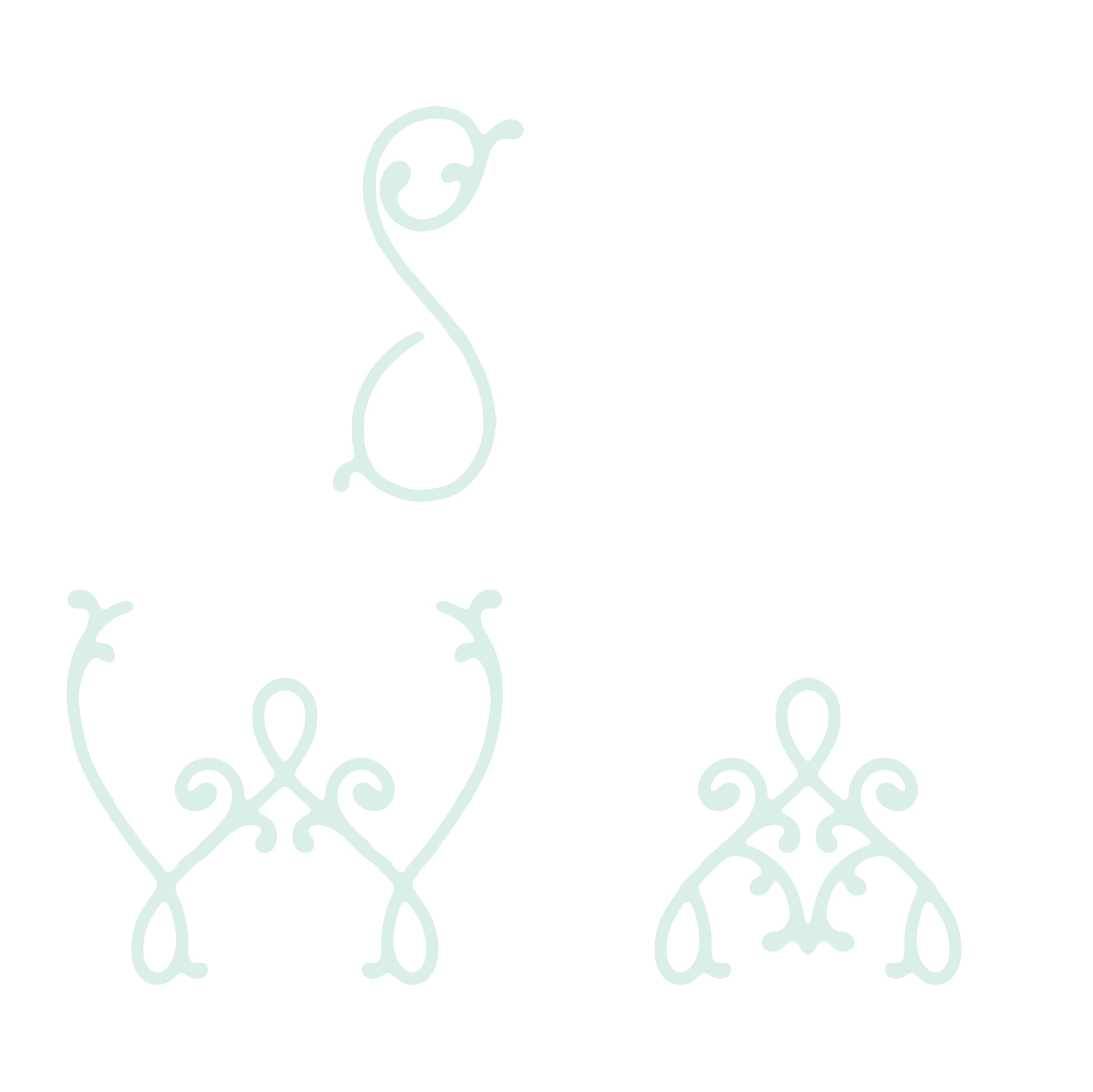
Stillwater is a poetry publisher that focuses on full collections and/or anthologies. For their logo, I tried to go in a more ornate direction, creating a squared filigree shape that includes the letters "S", "W" and "A".
The main inspiration for the brand and its logo was ROMANTICISM. The logo represents the ornate gates to a XIX century English garden.
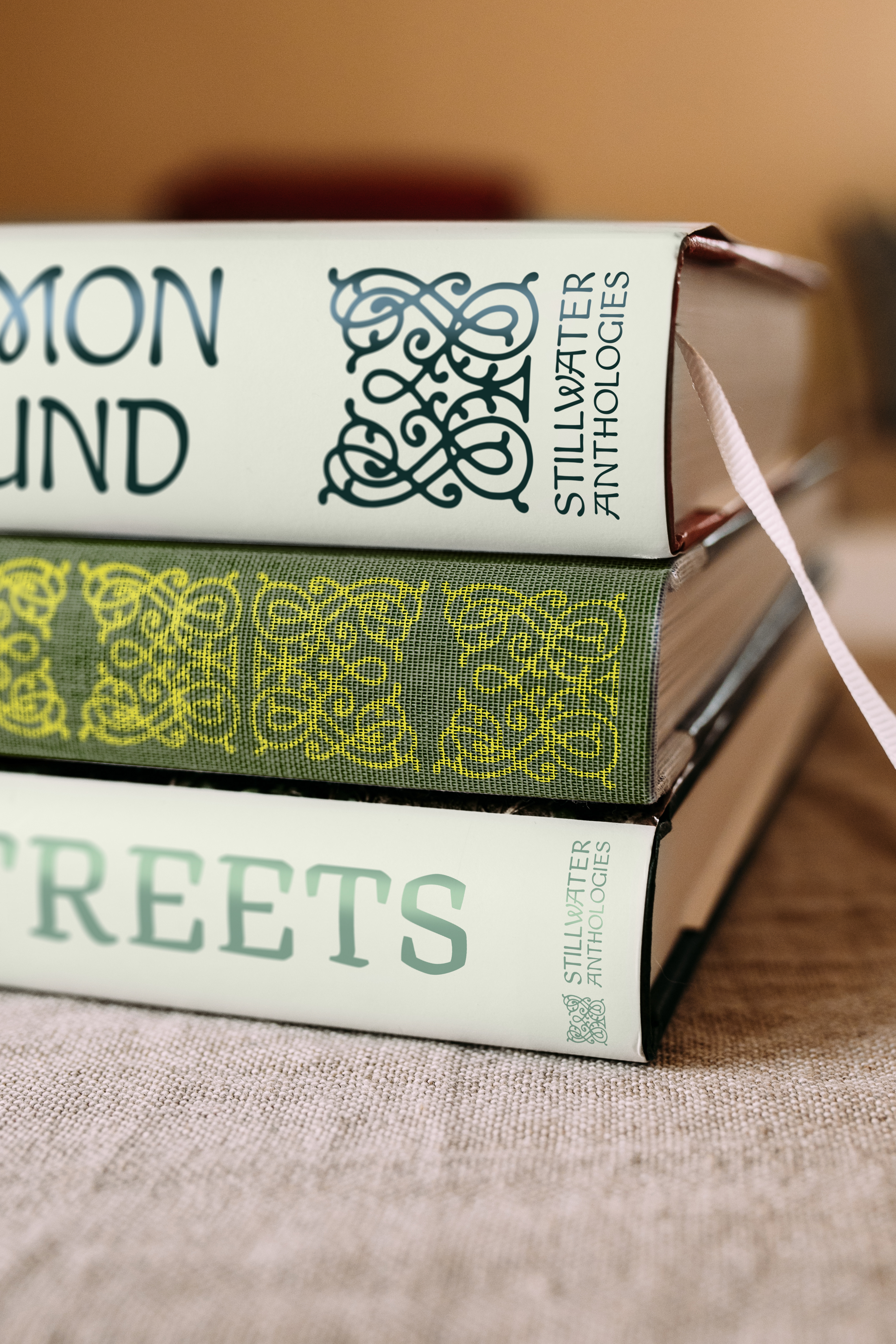
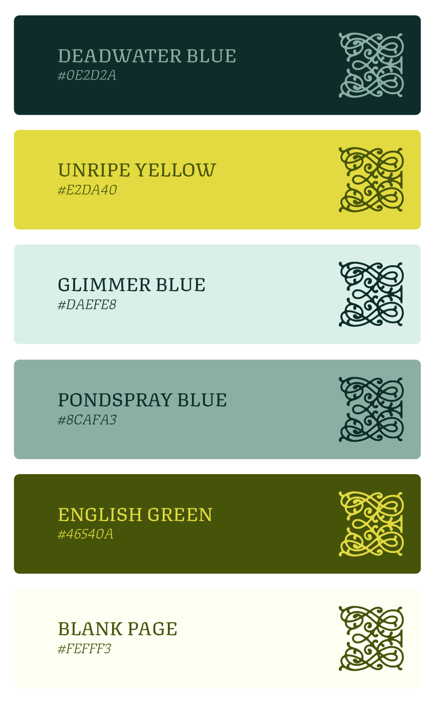

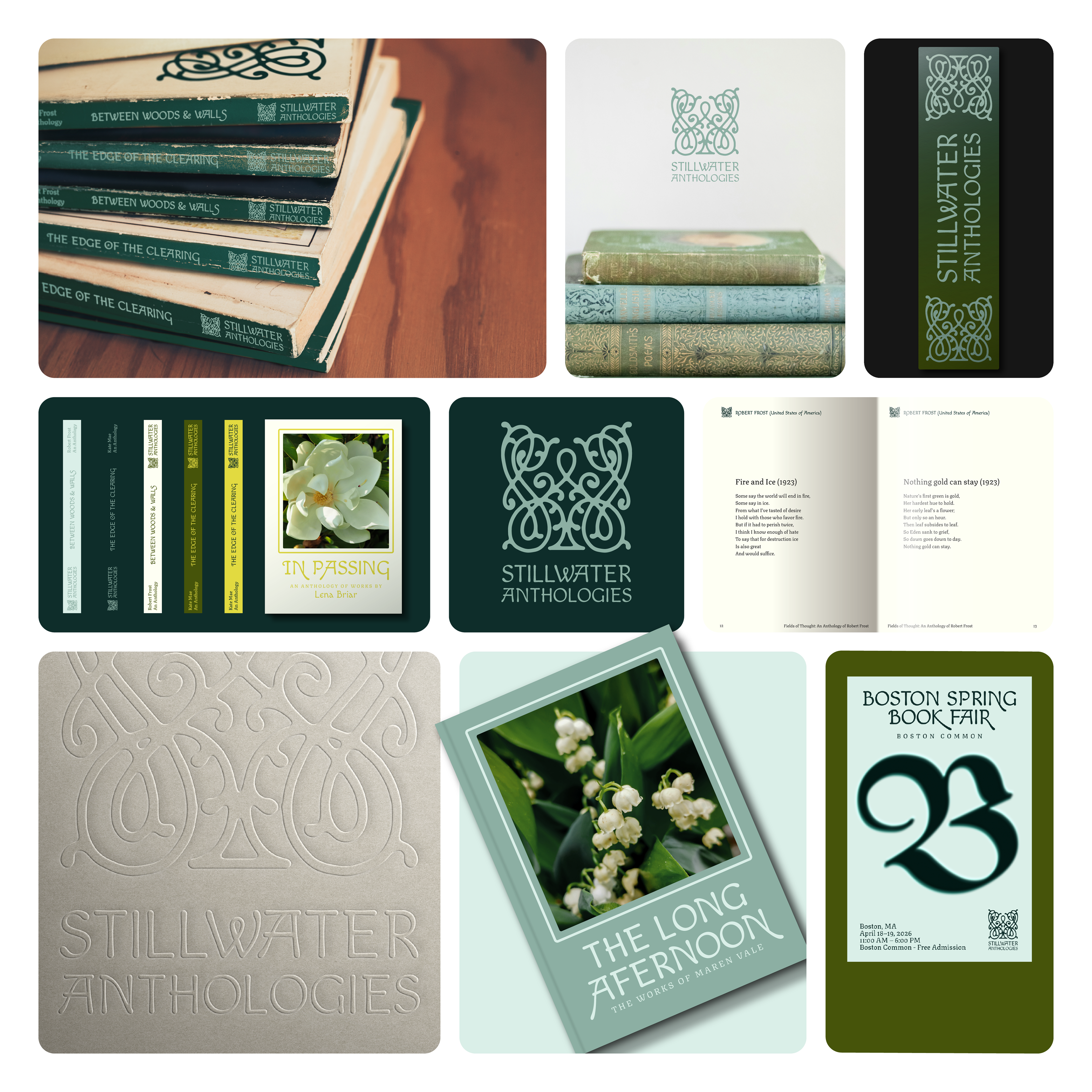
Stillwater Anthologies
Brand bento.
With every branding project, I like to add a selection of visuals that synthesizes the brand's aesthetics and visual feel. All neatly packaged like a well arranged bento box!
_________________________________________________________________________
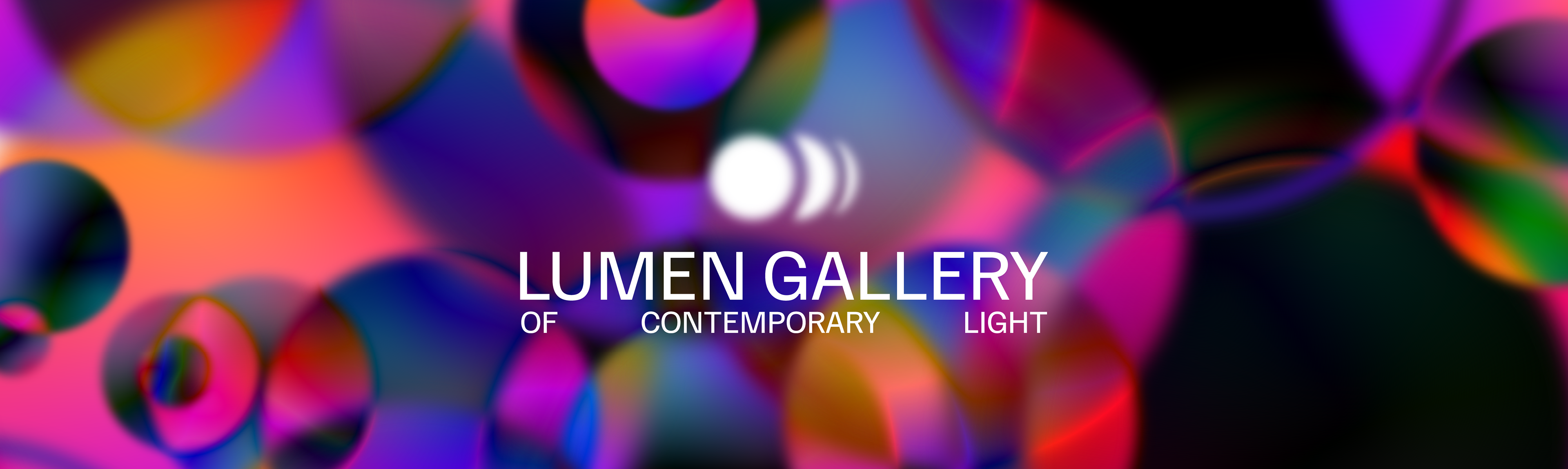
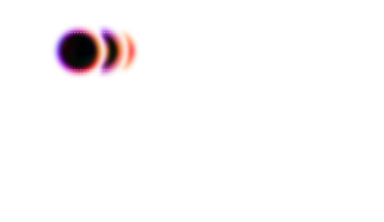
Brand #3
Lumen Gallery of Contemporary Light in Barcelona is a fictional immersive museum dedicated to cutting-edge light art and interactive digital installations. Their logo plays with the edges of the visible spectrum, making violet and red tones the protagonist.
The shapes used also represent the so-called wave-particle duality attributed to phenomena such as light itself.
The logo for Lumen Gallery lies between ULTRAVIOLET and INFRARED.